-
- How the news took over reality. [The Guardian]
- How Big Tech Threatens Economic Liberty. [The American Conservative]
- Apple Cracks Down on Apps That Fight iPhone Addiction. [The New York Times]
- Technology may be making us unhealthy and miserable – governments must act now. [The Conversation]
- The Ruin of the Digital Town Square. [The New Atlantis]
- Smart cities aim to make urban life more efficient – but for citizens’ sake they need to slow down. [The Conversation]
- City OF Things or City FOR People? [REAL CORP 2019]
- Drones to deliver incessant buzzing noise, and packages. [The Conversation]
- Is 5G worth the risks? [Open Futures]
- Online abuse: teenagers might not report it because they often don’t see it as a problem. [The Conversation]
- Technology cuts children off from adults, warns expert. [The Guardian]
- What Will You Say to Your Grandchildren? [Patterns of Meaning]
- Degrowth vs. the Green New Deal. [briarpatch magazine]
- Degrowth is utopian, and that’s a good thing. [Uneven Earth]
- Protect our right to light. [nature] Via Wrath of Gnon.
- The urban farming ‘revolution’ has a fatal flaw. [Quartz] Via Cynthia Hathaway.
No Tech Reader #24
Evaporative Air Conditioning
 Evaporative coolers have been known to purveyors of low-cost, sustainable technologies for years. Without the need for electricity, these cold containers have kept produce fresh from farms to tables, protecting against post-harvest losses in the field and food spoilage in hot pantries worldwide.
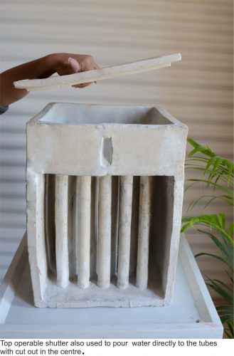
Now the concept has been applied to air conditioning. Manoj Patel Design Studio in Vadodara, Gujarat (India) has built evaporative air conditioners that can cool a room for days on a single tank of water. The studio designs new products from recycled materials, and they built their air conditioners from ceramics and stone, integrating them with potted plants. By filling rows of ceramic tubes with water, the prototypes maximize their surface area for optimal evaporation while retaining a small footprint.
Read more: This Air Conditioner for Homes and Offices Uses No Electricity, Engineering for Change. Previously: How to keep beverages cool outside the refrigerator: the botijo.
Sustainability Gains from Meat Alternatives
“Meat, an important source of protein and other nutrients in human diets, is one of the major drivers of global environmental change in terms of greenhouse gas emissions, land and water use, animal welfare, human health and directions of breeding. Novel alternatives, including novel meat proxies (cultured meat, plant-based meat alternatives), insects and novel protein sources (like algae) receive increasing attention. But plausible socio-technological pathways for their further development have not yet been compared in an integrative, interdisciplinary perspective.”
“High levels of transformation and processing limit the environmental sustainability gains of cultured meat, highly processed plant-based meat alternatives, algae- and insect-based food. At the same time, a high degree of societal coordination is needed to enable the potentially disruptive level of technological, organisational and institutional innovations needed to make these novel alternatives viable. Widespread expectations that solutions require break-through novelties or high-tech alternatives imply a neglect of existing and viable alternatives.”
“Our integrative analysis suggests that the priority given to meat alternatives with limited sustainability potential does not just raise questions of technological optimisation of production systems, but is also a second-order problem of the framing of search directions.”
Read more: Meat alternatives; an integrative comparison, Cor van de Weele et al., Trends in Food Science and Technology, April 2019. Image: Presentation of the world’s first cultured hamburger being baked at a news conference in London on 5 August 2013. World Economic Forum (CC BY 3.0)
I’m not optimistic, but that doesn’t make me a pessimist
Environmental scientist Giorgos Kallis in Knowable Magazine:
“We know there were civilizations that flourished in periods where they did not necessarily expand economically. Greece in the classical period would be an example. And many civilizations tried to put limits on how much money an individual could accumulate, or how much money you can lend, or interest rates. We have examples where we know society tried to limit and tame this self-perpetuating character of growth. And we know there are societies that flourished without having constant growth.”
“The easy but stupid critique to that is, “Oh, you want us to go back and be like hunter-gatherers or live like the Romans?” No, that’s not the point. We’re not saying look at how other civilizations are better, we’re saying let’s study other civilizations to get ideas about how things could potentially work differently in our society”.
Do you think we’ll get this figured out in time?
“I’m not optimistic. To think that tomorrow people will wake up and come to their senses and realize that climate change is a huge problem and economic growth is unnecessary, and take action on that? No, I don’t think this will happen. But this doesn’t make me a pessimist. History has always been dire. I don’t think I’d be better off living 100 years ago, having two world wars in front of me, or facing famines. History never stops, and constantly there’s a moment of fighting for things to be better.”
“The last 200 years, we lived in a capitalist society where growth is fundamental for the stability of the system. Maybe there is no alternative, and the only way is to have growth. If this is becoming catastrophic, what do we do? Do we bow our heads to catastrophe, to disaster, or can we think outside of that? We know that we humans are very inventive. Why can’t we think of alternatives? Why is this the only thing where we can’t think differently?”
No Tech Reader #23
- Venezuela blackout devastates country’s second city as world focuses on Caracas
- As Costs Skyrocket, More U.S. Cities Stop Recycling
- Resource extraction responsible for half world’s carbon emissions
- Escaping the Iron Cage of Consumerism [via Aaron Vansintjan]
- How Tech Utopia Fostered Tyranny
- If Stalin Had a Smartphone
- Alone together: how mobile devices have changed family time
- The Urban Home as Fortress [Via Wrath of Gnon]
- Do Not Disturb: How I Ditched My Phone and Unbroke My Brain
- The racism of technology – and why driverless cars could be the most dangerous example yet
Another Day, Another Low-tech Website
French designer and researcher Gauthier Roussilhe was inspired by our solar powered website and built a low-tech website himself, documenting the process in detail (and in English). It’s a great work, and there’s some interesting differences with our solar powered blog.
First, Roussilhe built his site with a user friendly content management system (Kirby), which is then converted into a static website. Compared to our approach, this makes it easier to build a light-weight website for those who are accustomed to working with WordPress.
Second, the designer also tackles his videos, which are hosted on Vimeo and Youtube, and manages to reduce their “weight” by 75%. This is a major contribution, because video takes up the largest share of internet traffic.
Here’s his own conclusion:
If we take stock: I reduced the weight of my site by 10, the average weight of a page by more than 3 and I reduced the weight of my videos on third-party services by 4. I have a site extremely simple to administrate, very light so very fast, which consumes very little electricity and therefore emits little GHG.
The site also follows all the canons of today’s digital design: mobile-first, accessibility, loading speed. In fact it is quite surprising to realize that structural limitations (weight / energy) lead to navigation experiences much more accessible to all audiences regardless of their equipment, their connection or their imperative motricity or vision.
Read more: Digital guide to low tech.


